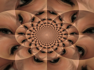
Cartier-Bresson Exhibit
I thought that the Cartier-Bresson exhibit was amazing. The way he captured all the intimate moments of these people's lives was breath-taking. I also loved the piece at the entrance of the exhibit. It was a huge display that panned across an entire wall and it was composed of many different and unique faces, which, in my opinion, was a great pre-cursor to the actual exhibit. Cartier-Bresson traveled all around the world from Japan to Mexico and in each country, he managed to capture the essence of the time he spent there and of what was currently happening in those countries. My favorite piece of the entire exhibit was called "Brie, France" 1968 on Gelatin silver print. I love how the lines of the trees lead you into the background of the photo. You are first lured in by the dirt road and then your eyes follow the path of the trees. It is a mesmerizing photo and it was one of the only ones I saw of simply landscape and not of people.
Exposed Exhibit


I thought that the "Exposed" exhibit was very diverse and beautiful. I loved the culmination of all the different photographers in one room, it almost had a dizzying effect on me. I saw beautiful and famous photos like Harry Callahan's "
Atlanta", 1984 in dye transfer print, I love this picture because of the many contrasts in it. The beautiful patterned red fabric of the dress afainst the clear blue sky and the gray of the buildings, also the different lines in the scene. The striking white line on the pavement and the lines of the windows on the buildings make this photograph phenomenal. I also saw a couple photos of Nan Goldin's that I was very happy about because even though she is famous in America, I did not realize she was so famous to have her photos featured next to ones taken of Marilyn Monroe. I also saw an extremely powerful photo taken of Richard Avedon after one of his surgeries. He had a series of scars along his stomach and it was painful to see this photo. It is also beautfiful in a solemn way because even though it looks like he is in pain, or has been suffering, he is wearing a tough leather jacket to illustrate that he is not done fighting. It is a truly powerful photo and it was a truly powerful exhibit. I strongly recommend seeing both these exhibits before they are over at the SF MOMA.


